


RésIn is a directory of engineers and technicians working on scientific research, which was created by the Medialab of Sciences Po and by the Paris Cité university. It aims to put forward the skills and knowledge of its participants despite the university or institution where they work. For this logotype, the taken approach was to develop a strong symbol that works as an icon and that represents the cross-pollination of knowledge from different fields. The metaphor of a crossroad or of a tree canopee was used. The custom wordmark employs condensed letters inspired by sign painting. The subtitle caption is set in a custom typeface inspired by the DIN system (which links it to engineering) but with an unique French flair. The warm autumn colours recall the earthy tones used through the visual identity of the website. This project was done in collaboration with Studio Variable.

Civette is a custom pixel font that presents stylistic echoes from the European renaissance and modern era (Giovanni Ostaus, the Romain du Roi) mixed with influences from the digital revolution times (Susan Kare's Broadway, in terms of contrast, as well as deprecated system fonts). At the same time, Civette is a functional text typeface, in roman and italic styles, providing comfortable readability for webpages without blending in the background. It was originally developed for Hawaii-based art studio Juliette Lily. Some of its most defining features are a lowercase "g" with an ample loop and a capital "R" with a straight leg. Based on the same pixel style, a set of borders and backgrounds was designed.

Praise Be! is an upcoming strategy and RPG video game by Meaning Machine Games that works as a "prayer simulator". As such, the logotype was inspired by the weight that religious beliefs can have on a society. The game will include featureless characters, which were an inspiration for the human figures under the letters. Other influences were 3D "stone carved" logotypes such as the ones of the films "Ben Hur" and Monty Python's "The life of Brian", as well as certain geometric letter styles commonly seen in contemporary graffiti. The logotype for the game was revealed in 2025.
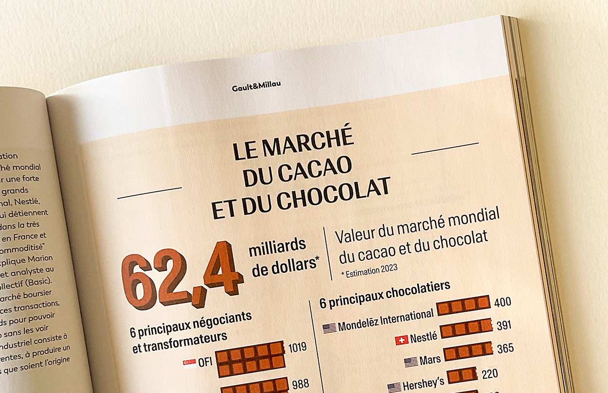
A series of infographics designed for the redesigned edition of the Gault&Millau magazine, dedicated to "seeing the world through gastronomy", according to their own words. The infographics offered a comprehensive overview of the global cocoa and chocolate market, covering everything from production and processing to sales.

Dead Meat is an upcoming video game by Meaning Machine Games that takes place in a fictional artificial meat company. The main cultural referents for the art direction were film noir classics from the 1940s as well as visual ephemera of that era. For this project, an unusal stackable logotype was designed, of which either the full logotype or the wordmark alone can be used, depending on the context. The logotype was designed extensively by hand before the production of a vector-traced version. A series of textures inspired by ground meat was also created.

Meaning Machine is an innovative company based in the UK that's changing the ways video games are being made. By employing Natural Language AI, they're able to create interactive Non-Playable Characters (that they call "Active Agents"), for instance. Meaning Machine launched in spring 2023. The icon of the logotype was designed with human-machine interaction in mind while the wordmark represents the fun-forward and indie-scale qualities of the company. While the wordmark can seem complex at first, it has been optimised to perform well at very different display sizes.
Luperca is a custom typeface that imagines a possible evolution of monumental Roman capitals, with some contemporary details as well as some classical structures that are somewhat unusual in nowaday's typefaces.
Luperca was created for the 11th issue of Cercle magazine, which was dedicated to Mythology. The typeface was used on the cover and interior pages of the magazine, designed by Cercle Studio.

Unknown number is 'a first person talker', a new genre of videogames that you play by using your voice, created by Meaning Machine
(formerly known as Godolphin Games). Through a series of phone calls, you can help the environmental activists of the game to perform a daring heist taking place on an abandoned oil rig.
For this project, extensive art and type direction work was realized: from creating the main logotype to sub-brand logotypes, a custom typeface, icon design, character design and user interface. Unknown number was released on Steam the 21st September 2022.

I Love Roubaix is a typeface inspired by the history of Roubaix, a city in the north of France. Roubaix knew a certain growth during the industrial revolution in the 19th century.
The I Love Roubaix typeface was developed at the request of the Roubaix Tourism Office and of the atelier Bien Vu. Its design is based on brick-shaped modules, as a reference to the predominant building method in the city. On its smaller optical sizes, its brick texture is reinforced with internal connections that recall the path of seams found in textile patterns. This way, this typeface creates a bridge between two main features of the city: brick architecture and textile industry. You can download "Roubaix Industrielle" (a libre/open-source version of the I love Roubaix typeface) on the Tunera Type Foundry.

Trialogues is a research project by philosopher Pablo Pérez Navarro for the Center for Social Studies of the University of Coimbra. The logotype of the project is based on the notion of cultural exchange, where communication stems from the combination of shared points of view and not from individual declarations.

A series of illustrations for The Good Life magazine about the rise of the Netflix company. The hero illustration features themes common to the streaming service (science-fiction, historical drama, medieval fantasy, nature documentaries), while secondary illustrations dwelve into the details of films and series financed by it. Objects and symbols refer to specific episodes of the series and act as easter eggs for devoted fans.
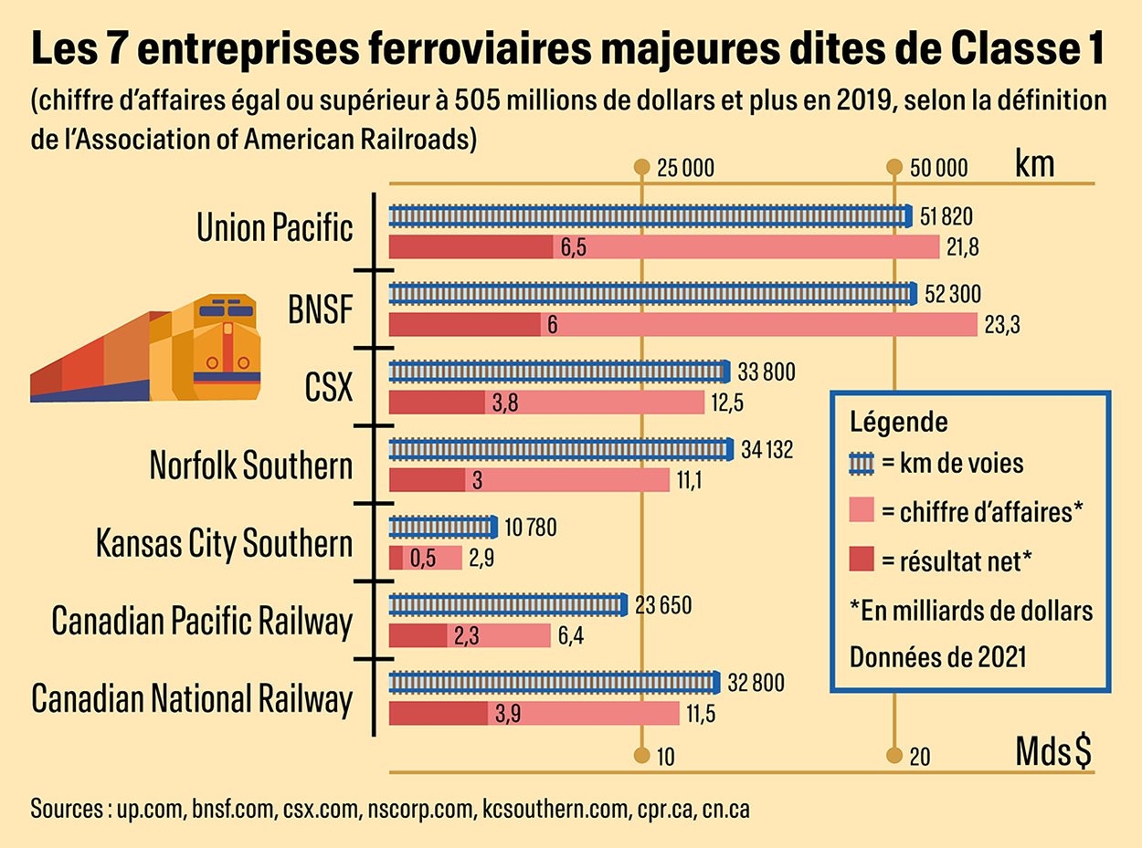
An infographic for The Good Life magazine comparing the seven major freight train companies in the US. Total rail lenghts, total revenue and net revenue of these companies are assembled in a two-axis chart, so the space the infographic takes on the page is optimized.

Irichen is a small company in El Hierro, Canary Islands, specialised in fresh organic produce and craftmanship. The name of the company refers to an ancient Canarian word for "wheat", as a way to signify fertility.
The client sought a circular logo that could be applied as an inked stamp to fruit crates and packaging. The symbols contained in it represent the sun (it's spiral shape refers to ancient engravings found on the Canary Islands) and a wavy sea.
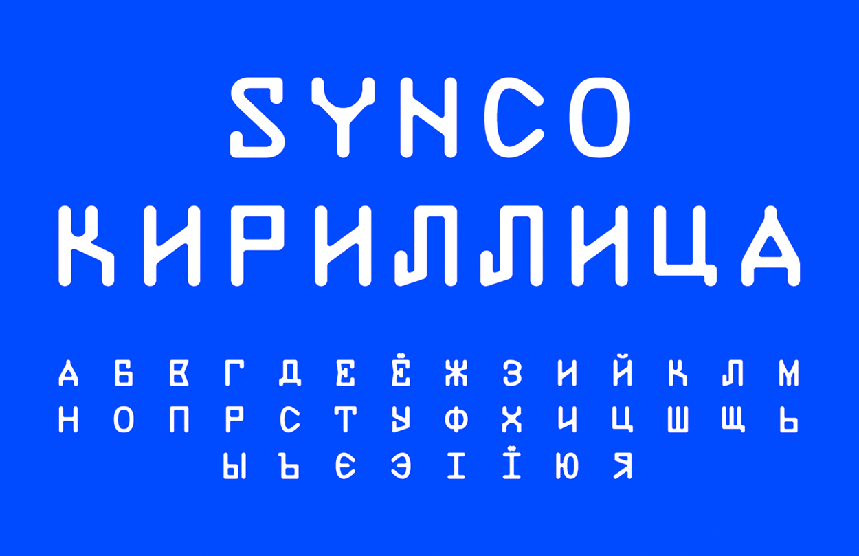
Synco is a monospace typeface inspired by Viafont, a typeface designed by Harry L. Preble for Viatron OCR machines in 1969. Synco was imagined by Raphaël Verona for a London-based sportswear brand and released as open-source in 2020. In 2021, an update of the Synco font with a Cyrillic extension by Ariel Martín Pérez was released on the Altiplano website, you can download it here.
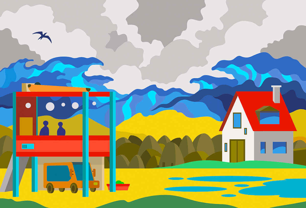
For this depiction of rising sea levels in the Atlantic due to climate change, a bold colour palette were used, as well as references to the local architecture and landscape of Normandy and to Hokusai's "The Great Wave off Kanagawa" print. The waves seem to float into mid-air as they loom over a disquiet scene, announcing impending doom.

Picaflor is a hybrid display typeface with a French didone skeleton and many calligraphic surprises, inspired by the Spanish vernacular tradition. It comes in 7 optical sizes for your convenience (and a variable version). You can download Picaflor now for free on Tunera Type Foundry.
Picaflor was created for the 9th issue of Cercle magazine, which was dedicated to flowers. The typeface was used on the cover and interior pages of the magazine, designed by Cercle Studio.
Tainome contributed some glyphs to the Quarantype typeface, a collaborative open-source project initiated by fonderie.download during the first lockdown of 2020. These glyps were inspired by some overlooked subcultures and movements, from baroque to grindcore through tribal tattoos. You can download the font files (published under the WTFPL licence) on the fonderie.download's website.
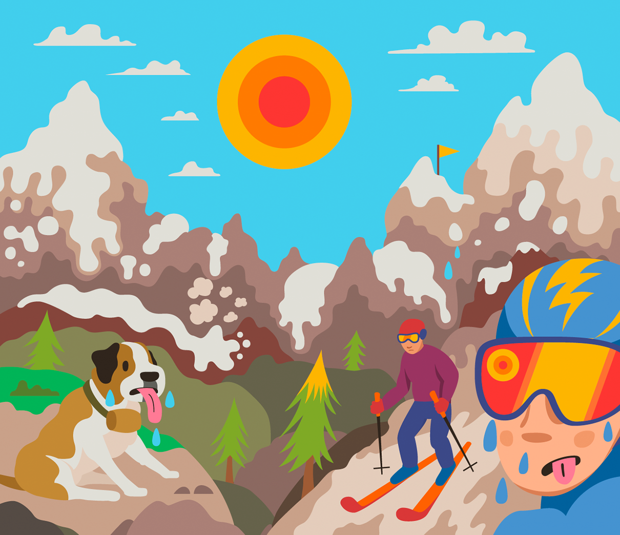
A series of illustrations about the effects of ski stations on climate change and viceversa. The original article also spoke about good practices that ski resorts can put into effect so skiing can become more sustainable.
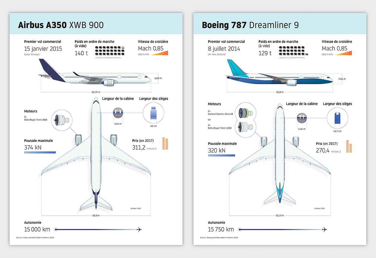
Side-by-side comparison infographic between two equivalent Airbus and Boeing planes. Data and pictures from many different sources were combined in order to reproduce the aspect of the planes and to present their main features.
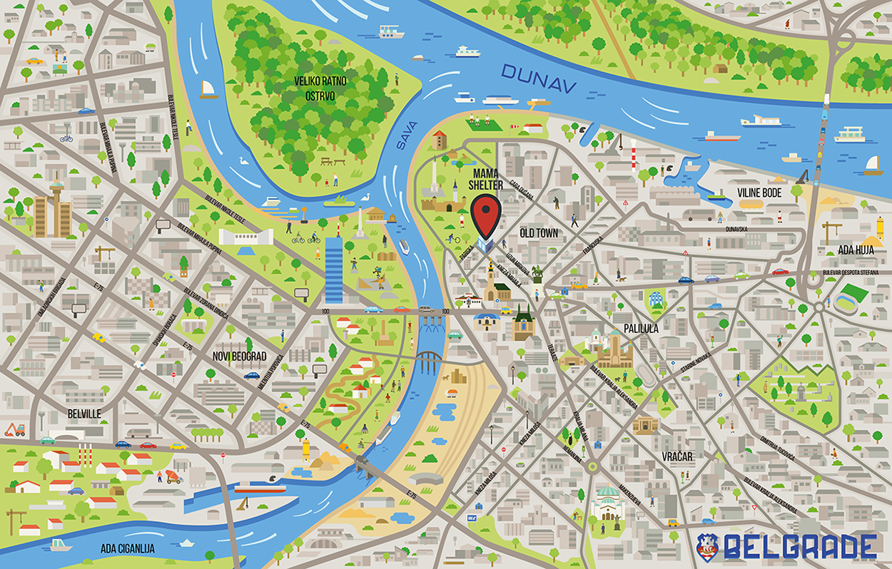
Custom illustrated maps of the cities of Belgrade and Prague for Hey Mama!, the official magazine for the Mama Shelter hotel chain. The mission was to show the city highlights on a very detailed environment, with lots of characters, while clearly presenting the street grid and the location of the hotel within the city.
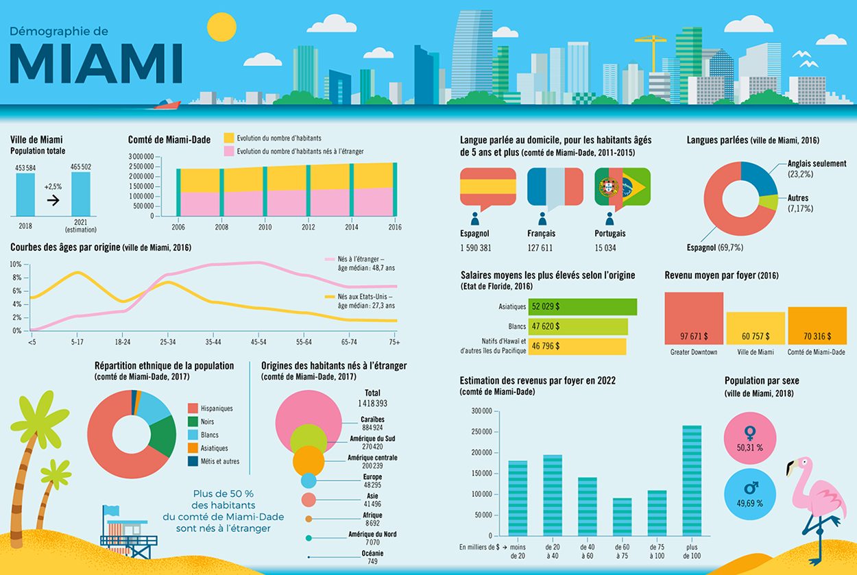
A double-spread infographic for The Good Life magazine about the demographics of the Miami county and Miami DAE. The colour palette, with its pink and yellow tones, was inspired by the city's culture. Featuring the ever-growing skyline, a beach cabins and the notoriously elusive pink flamingo.
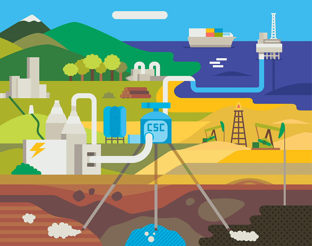
CSS (CSC in French) is "a technology that can capture up to 90% of the carbon dioxide (CO2) emissions produced from the use of fossil fuels in electricity generation and industrial processes" (according to the CCSa). This illustration for The Good Life magazine is partially inspired by a midcentury Petroleum Club mosaic by John Smith that was uncovered at the old Statler Hotel in Los Angeles in 2012.